
Posted 14 January 2013
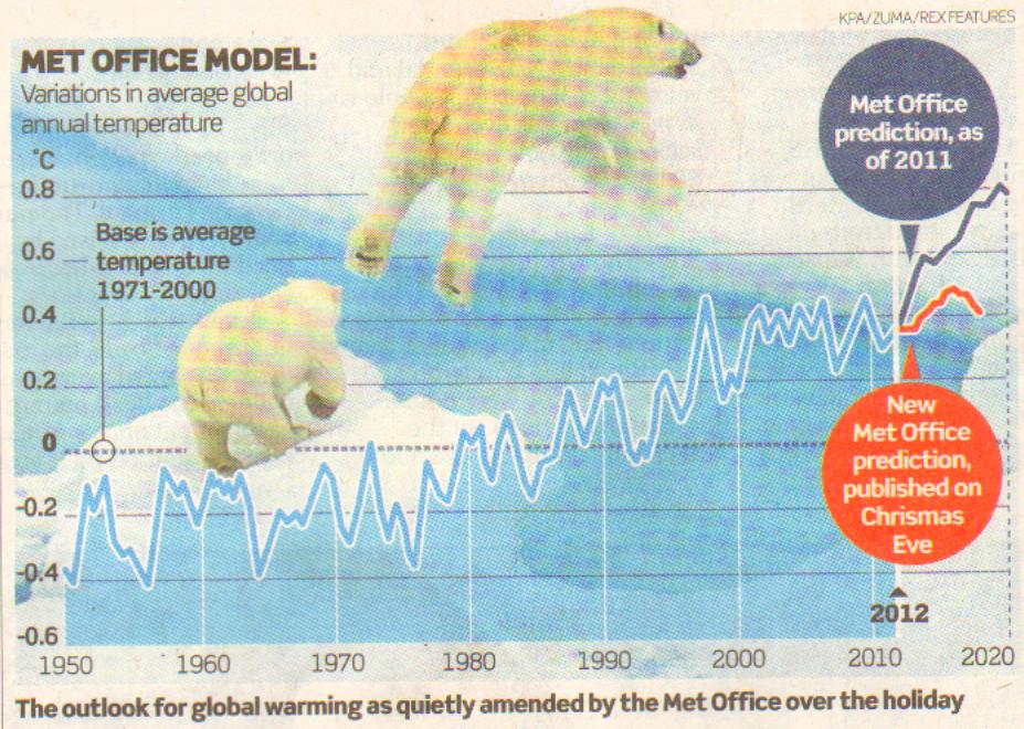
"On Christmas Eve the Met Office sneaked on to its website a revised version of the graph it had posted a year earlier showing its prediction of global temperatures for the next five years. Not until January 5 did sharp-eyed climate bloggers notice how different this was from the graph it replaced. When the two graphs were posted together on Tallbloke’s Talkshop, this was soon picked up by the Global Warming Policy Foundation which whizzed it around the media." Christopher Booker reveals all in UK Daily Telegraph
See graph here

12 Jan 2013
It is the graph the Met Office didn’t want you to see, in an episode which, according to one newspaper, represents “a crime against science and the public”.
Inevitably last week it didn’t take long for the bush fires set off by Australia’s “hottest summer ever” to be blamed on runaway global warming. Rather less attention was given to the heavy snow in Jerusalem (worst for 20 years) or the abnormal cold bringing death and destruction to China (worst for 30 years), northern India (coldest for 77 years) and Alaska, with average temperatures down in the past decade by more than a degree. But another story, which did attract coverage across the world, was the latest in a seemingly endless series of embarrassments for the UK Met Office.
Some of this story may be familiar – how on Christmas Eve the Met Office sneaked on to its website a revised version of the graph it had posted a year earlier showing its prediction of global temperatures for the next five years. Not until January 5 did sharp-eyed climate bloggers notice how different this was from the graph it replaced. When the two graphs were posted together on Tallbloke’s Talkshop, this was soon picked up by the Global Warming Policy Foundation which whizzed it around the media.
The Met Office’s allies, such as the BBC’s old warmist warhorses Roger Harrabin and David Shukman, were soon trying to downplay the story, claiming that the forecast had only been revised by "a fifth", and that even if the temperature rise had temporarily stalled, due to “natural factors”, the underlying warming trend would soon reappear. But they were only able to get away with this by omitting to show the contrast between the two graphs.
In 2011, the Met Office’s computer model prediction had shown temperatures over the next five years soaring to a level 0.8 degrees higher than their average between 1971 and 2000, far higher than the previous record year, 1998. Whereas the new graph shows the lack of any significant warming for the past 15 years as likely to continue. Apart from how this was obscured by the BBC, there are several reasons why this is of wider significance for the rest of us.
Related Articles
-
The BBC is a picture of modern Britain, with its shameless lack of blame
22 Dec 2012
-
The BBC's 'dirty little secret' lands it in a new scandal
17 Nov 2012
For a start, it is not generally realised what a central role the Met Office has played in promoting the worldwide scare over global warming. The predictions of its computer models, through its alliance with the Climatic Research Unit at the University of East Anglia (centre of the Climategate emails scandal), have been accorded unique prestige by the UN’s Intergovernmental Panel on Climate Change, ever since the global-warming-obsessed John Houghton, then head of the Met Office, played a key part in setting up the IPCC in 1988.
A major reason why the Met Office’s forecasts have come such croppers in recent years is that its computer models since 1990 have assumed that by far the most important influence on global temperatures is the rise in atmospheric carbon dioxide. Yet as early as 2008, when temperatures temporarily plummeted by 0.7 degrees, equivalent to their entire net rise in the 20th century, it was already clear that something was fundamentally wrong with this assumption. The models were not taking proper account of all the natural factors governing the climate, such as solar radiation and shifts in the major ocean currents. Even the warmists admitted that it was a freak El Niño event in the Pacific which had made 1998 the hottest year in modern times.
But the Met Office was not going to abandon easily its core belief that the main force shaping climate was that rise in CO2. As its chief scientist, Julia Slingo, admitted to MPs in 2010, its short-term forecasts are based on the same “numerical models” as “we use for our climate prediction work”, and these have been predicting “hotter, drier summers” and “warmer winters” for decades ahead. Hence all those fiascos which have made the Met Office a laughing stock, from the “barbecue summer” that never was in 2008, to the “warmer than average winter” of 2010 which brought us our coldest-ever December, to its prediction last spring that April, May and June 2012 would probably be “drier than average”, just before we enjoyed the wettest April and summer on record.
Such a catastrophic blunder is scarcely mitigated by the Met Office’s sneaky attempt to hide that absurd 2011 graph. One day it will be recognised how the Met Office’s betrayal of proper science played a key part in creating the most expensive scare story the world has ever known, the colossal bill for which we will all be paying for decades to come.
Meanwhile, it is not just here that this latest fiasco, reported in many countries, has been raising eyebrows. Our ministers love to boast that British science commands respect throughout the world, They should note that the sorry record of our Met Office is beginning to do that reputation no good at all.